
")
ADA (Americans with Disabilities Act) requires that all public businesses follow their guidelines.
All businesses require wheelchair accessibility, which is necessary due to the Americans with Disabilities Act (ADA) of 1990. However, today companies should be concerned with their online presence, relating to these ADA guidelines.
So how does this law apply here? Since this law was written a decade before the rise of the internet, it never mentioned web accessibility. With it under interpretation, states have been defining this law themselves. Since a company's online presence is an extension of its business, most of these states claim that they are still a "place of public accommodation." In just the past year, according to the SD Times, there has been a 23% rise in web-based ADA lawsuits. Here is what you need to consider when building your website to avoid this.
Is your website accessible to visual impairments?

The recommended guidelines state that a website needs to be entirely accessible to screen reader technology (Pictured). These guidelines include captioning images so the screen reader can describe them to the user. Colors also need to be considered to create visibility for the visually impaired and color blind. Buttons throughout the website will also need to be reasonably large so there is no struggle to see or click on, using either a desktop or mobile platform.
Are your videos accessible to those with cognitive speech and auditory impairments?
All videos need captions and video transcripts to be completely accessible to everyone. Captions and transcripts allow everyone the ability to follow along and fully understand what they are watching.
Is your site accessible with a keyboard?
Those with neurological or motor impairments may have limited to no use of their arms. Keyboard accessibility will allow everybody to enjoy the site without having to move around a mouse.
Color Contrast Ratio Guidelines
International group, Web Accessibility Initiative of the World Wide Web Consortium, created the Web Content Accessibility Guidelines (WCAG). This group sets the standards internationally for web accessibility and created the rules for the color contrast scale. Contrast is the difference between two colors based on their color wheel position and their perceived brightness. This ratio is a way to numerically compare two colors based on how contrasting they are and how legible they are (W3C).
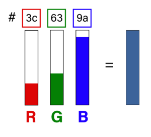
This system uses the hexadecimal (hex) scale and is a combination of 6 letters and numbers. Each of these represents the reds, greens, and blues of a color (#RRGGBB). To find the hex color code you can go to HTML-color-codes, upload an image, and then hover over the color to reveal the hex code
The contrast ratio takes two of these numbers and compares them on a scale ranging from 1:1 (white on White, low contrast) to 21:1 (black on white, high contrast). According to the WCAG, the minimum requirement is 4.5:1, equivalent to light grey on a white background. The ratio compares the contrast levels between the adjacent foreground and background (W3C). For example, on this page, there is black text in the foreground with a white background. This page gives a contrast ratio of 21:1 ratio, far beyond the minimum requirement.
Items beyond text must also fit these requirements. Hover effects must follow the contrast ratio for both the text and the background in both states. In addition, color cannot be the only indicator of meaning. Links in a paragraph cannot just be a different color, links must also include an underline, bold text, etc. to distinguish it.
Exceptions to WCAG
There are exceptions to these rules because various factors affect the legibility of a site. The WCAG has taken all of them into consideration. W3C describes these rules and their exceptions. The first exception is large text with a minimum contrast requirement of 3:1 instead of 4.5:1. Large text is defined as anything 18pt (24 pixels) in size or larger, or if the font is in bold it is 14pt (18.67 pixels) or larger.
The second exception is called incidentals. Incidentals are items that do not need to be seen to understand the content of a webpage. For example, any inactive elements, like disabled buttons (pictured), no longer need to fit the requirements. Another exception to these guidelines is decorations, pictures of bookshelves may have titles on the books that users do not have to read to understand the page. Also, anything that is not visible to anyone, like white text on a white background, does not need to follow contrast guidelines.
However, the text inside of a logo does not have any requirements. Lastly, any gradients, background images, or transparencies have no specific guidelines to follow. However, WCAG still recommends testing the lowest contrast point of an image. To test your color contrast ratio you can visit Coolers and enter in the hex codes to get exact contrast information.
The ADA law is up to interpretation
The ADA laws regarding websites are up to interpretation, meaning a successful lawsuit is not guaranteed. Still, having an accommodating website is the right thing to do. Every state interprets the law differently, while some disagree that it covers the web, others say the business's web platform is just an expansion of their in-person business.
Clarifications for this law regarding the internet have been proposed but have yet to become a reality. This proposal will keep coming up until it officially applies to websites. To create an equal opportunity environment all of these accommodations need to be considered when developing an online presence.
The best way to ensure an accessible webpage for everyone and avoid legal action is to have a consultation with a design professional who understands the WCAG. Contact us below to begin including accessibility to your webpage.