Color-Blind
Color blindness is a visual impairment that affects around 8% of all men and 0.5% of all women (Colour Blind Awareness). There are three main types of color blindness, red-green, blue-yellow, and complete color blindness. Each of these has its subcategories of severity. According to the American Optometric Association, deficiencies in cone genes are responsible for color blindness. Our eyes use cones to send signals to our brain when they receive and transmit bright lights and colors.
Most people who are color blind were born with this gene mutation. However, it is also caused by optic nerve issues, age, side effects of medications, and retinal diseases (National Eye Institute). Many people may not even know they are color blind until their age makes it more severe and obvious.
As developers design websites, this visual impairment should be tested for and considered to allow equal opportunity under the Americans with Disabilities Act (ADA).
Types of Color-Blindness
Deuteranopia (Red-Green) color blindness
Red-green color blindness is the first and most common type. Healthline's report states that red-green color blindness is typically caused by a deficiency in the red pigment cone and green pigment cone genes. This can make the colors red, green, and yellow look grey-toned and difficult to tell apart from one another.
Red-green color blindness can be one of two kinds, protan or deutan. Protan means green, orange, brown, yellow, and red all look similar. This leads to purples looking blue and reds looking grey and dark. Deutan color deficiency makes green and yellow, or blue and purple look nearly identical (National Eye Institute).
Tritanopia (Blue-Yellow) color blindness
Blue-yellow color blindness is less likely to be noticed from birth. Tritanopia is most commonly obtained later in life from aging or medical conditions, with an underlying gene mutation. This gene mutation causes sensitivity of the blue pigment cones in the eyes (Medline Plus).
The first subcategory is Tritanomaly, which makes blues and greens look alike, as well as yellows and reds. Tritanopia is the second subcategory, which darkens blues, greens, yellows, and pinks, and can make them look very similar (National Eye Institute).
Monochromatic color blindness
Colour Blind Awareness states that monochromatic color blindness is also known as complete color blindness. It is the total or partial loss of color, making everything duller than typical. Low vision disorders can also cause the loss of color vision over time, but typically this is a genetic condition. Complete color blindness is the least common of the three types of color blindness.
Testing for color blindness
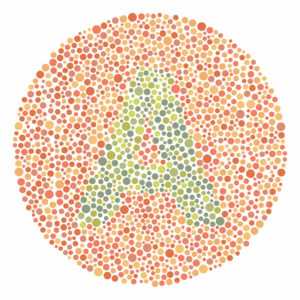
Pictured below is a common test, known as the Ishihara Test. Variations of this image test for color blindness, depicting two colors contrasting each other. The dots contrast to form an image in the middle, depicted here in this one is the letterform 'A'.

Impact on web interactions
Those with a color-blind visual impairment have difficulties accessing the web and using it to its full potential. Often websites will use color as an indicator. One example is a navigation map, red indicates high traffic, and green indicates low traffic. However, someone who has red-green color blindness will have difficulties differentiating between the two. This type of informative graphic would not be inclusive and does not provide the same opportunities for all of its users.
These problems are frequently encountered on maps, infographics, navigation systems, and online booking platforms. Using color alone as an indicator is a common practice, but there are simple ways to make it inclusive.
A Wall Street Journal article written by, Katie Deighton describes two companies who have recently shifted their platform's visual aspect to become more inclusive.
Zoom is a company that has made an inclusive change in recent years after receiving feedback that their (Leave Meeting) button was not legible to those with red-green color blindness.
In April of 2020 Zoom took action and changed the red text on the black background to white text on a red background. This simple shift of color was all it took to create a more inclusive program for everyone to use. Another company, Spotify, recently made a color-blind inclusivity change.
When users placed a song on shuffle or repeat the button would just change to a brighter shade of white, which was undetectable to many with color blindness. So in 2017, Spotify added a red dot on top of the white symbol to indicate that the user had pressed the button. A simple change that made their platform more inclusive.
Testing a site for color-blind inclusivity
Several online sites and web browser extensions are available to check a site's accessibility for colorblind users. These sites and extensions apply filters that simulate the types of color blindness. This allows those who do not have this visual impairment to see if their site is not inclusive. Browser extensions are a more versatile way to test web pages, it applies the filter but you can still fully interact with the site, rather than applying a filter to a snapshot of the webpage. Some browser extensions that allow you to test for visibility are:
Solutions for inclusive design
If a website appears inaccessible to people with color blindness, the solutions are simple.
One option is to change the colors so the text is legible and buttons are visible no matter the visual impairment.
On any site or graphic that uses color as an indicator, there should be another non-color-based indicator. Underlining a link or putting a diagonal pattern on a fully booked day is all that is needed.
Creating an inclusive website is necessary to provide everyone with equal opportunities. Today developers apply simple tools and solutions across the web to guarantee it. Along with these tools, design professionals who understand the ADA guidelines should be contacted to ensure a completely inclusive site. To learn more and to set up a consultation with a professional contact us below.
